In the Mood for Color with AECP
Hello and welcome back! I’m popping in today to share a card from my latest Altenew Educator Program courses.
Today’s card is from the In the Mood for Color class. I really, really enjoyed this class.
As a card maker, a lot of thought and planning goes into creating a card. At least it does for me. I’m not someone who can easily pick out a stamp set, color it and quickly put together a card. Many times, I have one or two stamps in mind to go along with a layout that I’ve thought about for a few days. I’ll color the images and add coordinating die cut elements or pretty papers.
How many times during the card making design process do we think about color as a tool to evoke a certain emotion? I know I don’t. Did you know that color can evoke emotion or behaviors in your audience?
Warm colors such as red, orange and yellow are often associated with feelings of warmth and happiness. Whereas the cool colors like green, blue and purple are most often associated with feelings of calm or soothing but can also relate to sadness.
The In the Mood for Color class from Altenew goes through some of the basic colors and discusses color as a design element in card making and shows several examples from some primary colors. Seeing the lessons with various colors really helps to see the feeling or emotion being conveyed in the card.
For my card, I tried out a new layering stencil that I purchased from Altenew recently. This is my first time trying a floral layering stencil and I’m kind of hooked.
Using the Flower Bunch Simple Layering Stencil set, I started out inking on some Altenew Dye inks as well as some Mixed Media inks. For each layer on the stencil there’s a different element that you’re inking whether it’s the leaves or flowers. These layering stencils were super easy to line up.
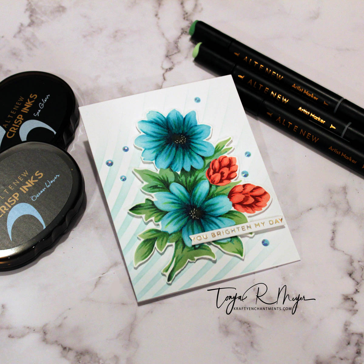
For the leaves, I used Ocean Water Dye Ink as an underlying color in combination with Frosted Glades and Evergreen Mixed Media ink.
I chose a sort of teal color for my flowers. Teal is a color that conveys restfulness and a mental/spiritual balance. The color teal is the combination of blue which represents tranquility and stability and green which conveys optimism and healing.
To color my flowers, I ink blended on the stencil layers using the Altenew die ink set of Sea Glass, Ocean Water, Dusk and Desert Night. This color combination is one of my favorites. For each layer I blended on ink from the lightest beginning with Sea Glass to the darkest near the flower center which is Desert Night.
For the little pinkish flowers, I used the mixed media inks in Coral Berry for the lightest color and Grapevine for the darkest color. I think this pop of color is a great contrast for the rest of the card.
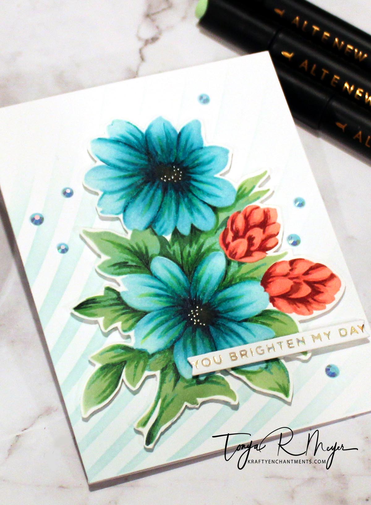
When every layer of ink blending was done I added some additional detail, shadows and coloring with my Altenew Artist markers using the newest marker sets to be released, Nature Views.
This was one of those projects where I couldn’t stop tweaking and coloring and ink blending. I had colored in some details with my Artist Markers and then went back and added in some more ink blending. At one point I felt like it was a hot mess however, I stayed with it and I think it turned out really good.
I kind of didn’t have a great ink for blending the centers; I went with the Desert Night but then added a layer of Vintage Photo Distress Ink as well.
To add the smallest hint of sparkle, I used a Moondust Gelly Roll pen and added some small dot details to the flower centers, but only on one side of each flower center for a bit of interest.
I fussy cut the flowers, added some dimensional foam to the back and added them to a stenciled background using the Altenew Molded Lines stencil and the Sea Glass ink. I like the soft blended background as it is so subtle with the bold flowers, but it keeps with my teal colored theme.
I used a simple hot foiled sentiment strip that reads, You Brighten My Day and added that to the lower part of the flower with dimensional foam.
For a bit of bling I added some coordinating gems to the card front with some liquid glue.

The In the Mood for Color class was so awesome! I really did learn a lot and it has given me some more perspective on color and how I will use it in my cards from now on to convey an emotion or feeling. I highly recommend this class.
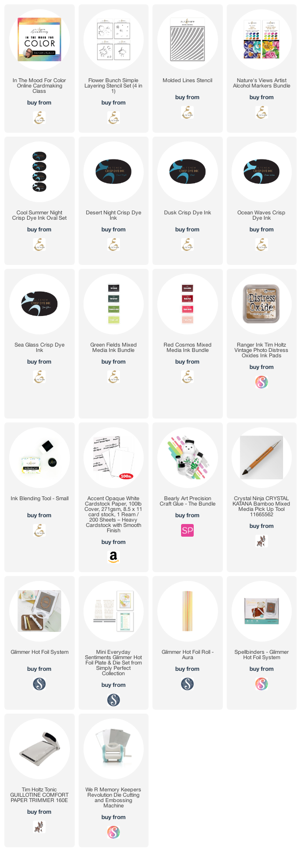
I’ve added links to all of the products used in today’s card below for your convenience.
Thanks so much for stopping by! I hope you’ve enjoyed today’s card!
Hugs,
Tonya
https://linkdeli.com/widget.js?id=f5e8378456858c916708


This is so so so beautiful, Tonya! LOVE everything you make!
Thank you for blessing my eyes with this beauty and submitting your work to the AECP assignment gallery.
LikeLike
Thank you so much Erum! You’re too kind!
LikeLike