Dare 2B Artzy New Release Hop
We are excited to be celebrating TWO things:
1: NEW STAMPS and Dies!!!! and NEW Totally Tracy Chipboard!
2: A New Design Team Term! We have some previous amazing designers continuing with us, but also have some fabulous new faces! We are super excited about this term!!
We decided to combine the two and have a blog hop!!!

You should have arrived here from Cindy & the Dare 2B Artzy blog! If you haven’t and would like to hop along with us, please go back to the Dare 2B Artzy Blog to start at the beginning!
Be sure to follow each blog and leave comments along the way for your chance at winning! We will randomly choose a winner from one of the blogs, so the more you comment, the more chances you have to win!!
Winner will receive a stamp set and ink pad of their choice!!
Blog Hop will end Sunday, February 19th at 7:00pm Central.
We will then post a winner!!
———
Hi All – Welcome to Dare 2B Artzy’s first blog hop of 2017! There is so much to talk about with all the new goodies from Dare 2B Artzy and Totally Tracy as well as the introduction of our phenomenal new design team.
Let’s get this hop rollin’!!
Today I’m sharing a card with a water color background from the new My Path Lighthouse stamp set. I realized when I was creating this card that for me, coloring lighthouses is very calming. Not sure what it is about them, other than I’ve always loved lighthouses and the stories behind them and the purpose they serve.
With most cards, I start by coloring my focal image. However, since I was going to do an ocean background with watercolors I decided that I needed to get my background done first. I’m such a novice at any kind of watercolor medium, I always feel like a kid discovering that they can do something for the first time – it’s that “hey, look what I did” moment. That’s exactly how I felt with this card.
I cut a piece of Canson 130 lb Watercolor paper that I’d cut down and scored in half. I placed the partially rounded rectangle die so that the top edge was actually off my paper and taped it into place to hold it while I ran it through my die cut machine. The finished piece was a top folding card that measures 3 ¾ inches wide x 4 inches tall.
Next, I picked out several shades of blue and a grey with my Kuretake Zig Clean Color Brush pens. The colors I used were Blue #30, Cornflower Blue #37, Persian Blue #32, Persian Green #33 and Blue Grey #92. I wish I could say I had a process for watercolor, but for me it’s a chance to play. I started by using one of my colors to draw a faint line which would be my horizon line (which really isn’t straight – but we’re imaging waves, right?!). With the horizon line drawn, I used a water brush and gently pulled the color from my horizon line down into the lower half of my card. I did a little coloring and when I was happy with how the color looked, I heat set it and add a different color or add water to lighten it a bit.
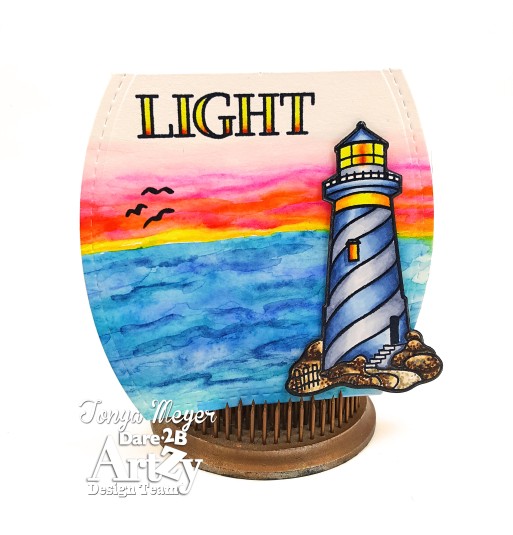
It is hard to know when to stop “tweaking” what you’ve done. I just had to force myself to stop by putting away my shades of blue Zig brush pens and then heat set the final color before moving on to my sunset.
For the sunset, the colors I used were Yellow #50, Orange #70, Pink #25, Peach Pink #202, Light Carmine #21 and Pink Flamingo #222. I created the sunset, by working up from the horizon line first adding yellow and blending that into the orange and eventually into the different shades of pink. In some ways the ocean was easier because the colors were all pretty similar. I was so pleased at how the sunset turned out. It was that, “Hey, look what I did” moment and it felt good.
With my background done, I set it aside and began working on my lighthouse. Originally, I’d stamped and colored the lighthouse in red and grey, but decided that the colors were too dark and bold for the background so I had to recolor another lighthouse. In the end I chose a blue grey combination. I stamped the lighthouse with black ink and then while the ink was wet I sprinkled on some clear embossing powder and heat set it.
I used my Copic markers and colored the lighthouse. For the blue I used B91, B93, B95 and B99 and grey was C1, C3, C5. I added some yellows and orange the light on the lighthouse and used browns and grey to add depth and dimension to the rocks at the base of the lighthouse.
Once I’d finished coloring I was ready to cut out the lighthouse using the matching lighthouse die from Dare 2B Artzy. After I cut it out I did use a black Copic marker and go around the edges of the final die cut peice and colored them all black to make the cut edge less visible against the background.
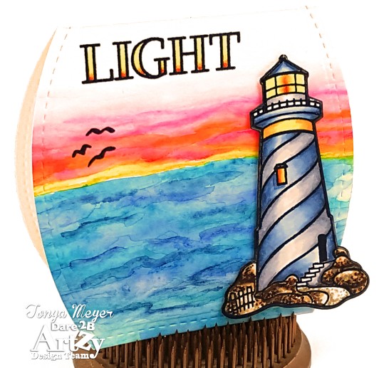
To finish my card front, I stamped the word Light and heat embossed with clear embossing powder. I added some orange and yellow ink with my brush markers and then blended with a bit of water. I also added the stamped birds flying into the sunset.
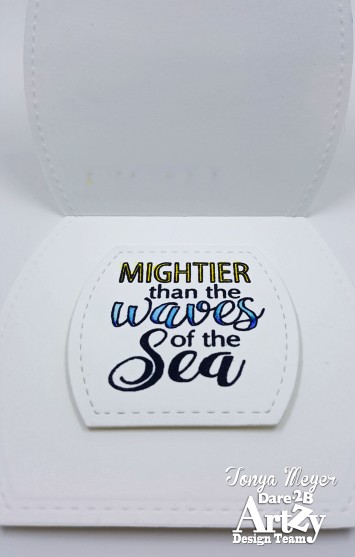
For my sentiment inside, I die cut another rounded rectangle that measured 2 3/8 x 2 ¼. I stamped the sentiment, Mightier than the Waves of the Sea with black ink and once again heat embossed with some clear embossing powder.
Once it was done, I used my brush markers to color in the word Waves in blue and Mightier in yellow to make it pop a little. I added a bit of dimensional foam before centering it inside the card.
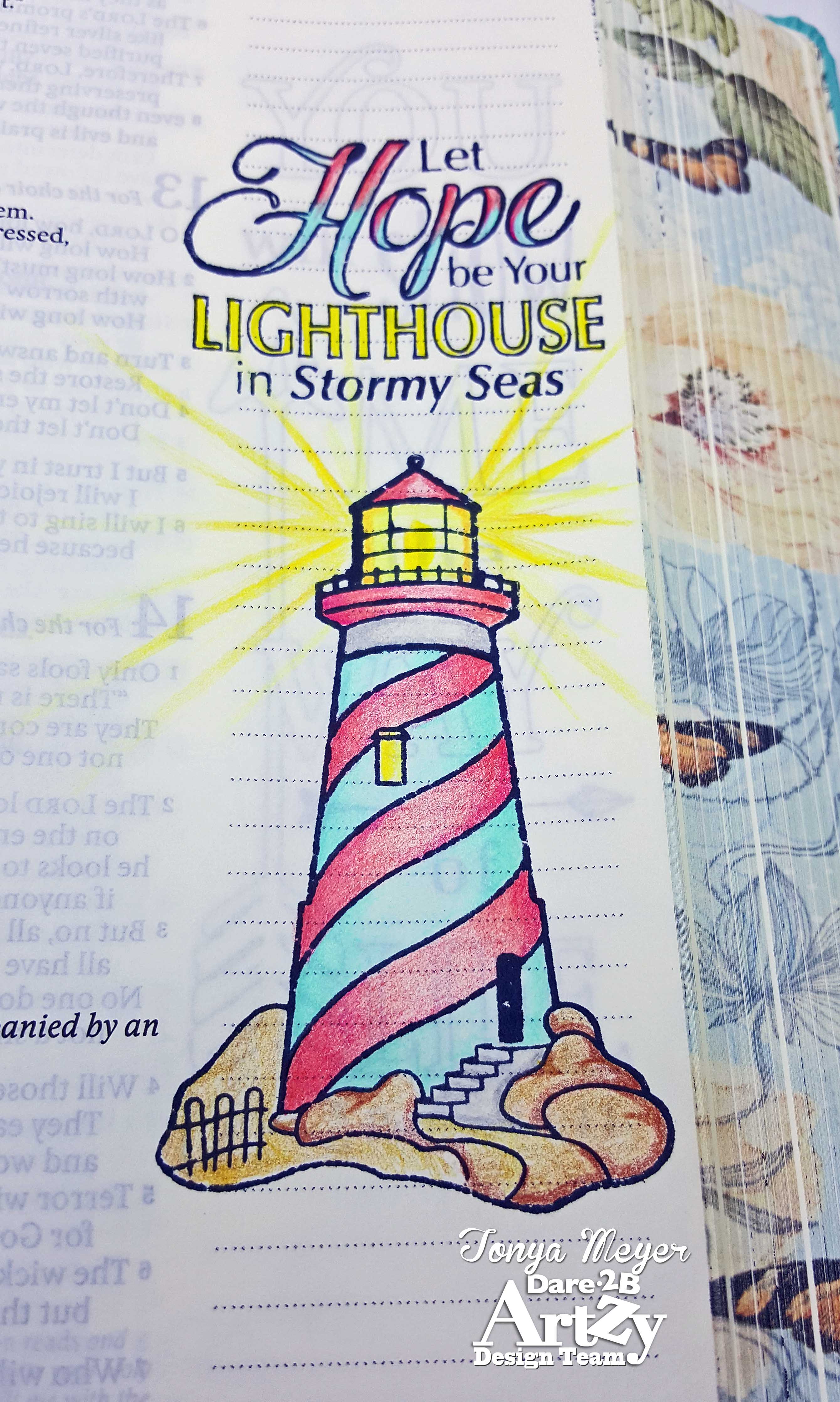
For another relaxing, meditative option I also stamped the lighthouse and the sentiment Let Hope be your Lighthouse in Stormy Seas into my Inspire Journaling Bible. I just love that sentiment. I’m new to Bible journaling so I’m still learning a lot about what mediums work best, etc. Since the Journaling Bible is made specifically for this purpose, I wanted to try stamping and coloring as I’d not really tried that before. I stamped with some black ink and colored my images with my Prismacolor Pencils. However, I realized quickly that the stamp ink was very visible on the back side of the page. I received a quick tip from Dare 2B Artzy owner, Cindy Sartain which was to try using gesso the next time to prevent the bleed through of the stamp ink on the Bible paper. I hadn’t even considered that so thank you to Cindy! I will be trying that next time as well as some other tips that I’ve received regarding Bible Journaling.

I’m so thrilled to be asked to come back for another term on the Dare 2B Artzy Design Team! Being on this team has really helped me to expand my level of creativity and try new things – I’m even getting my toes wet with videos – eek!! I love the amount of talent that each member of this team brings. Each of these lovely ladies are so encouraging and inspiring to each other and hopefully you will enjoy the projects that we’ll be sharing with you over the coming months & inspiring you to Dare 2B Artzy as well!
Hope you enjoy the hop and all of the fabulous inspiration you’re going to see along the way today! Remember to follow everyone’s blogs and be sure to leave comments at each stop along the hop for your chance to win that awesome Dare 2B Artzy prize. I mean, who wouldn’t want to win some of these fabulous new stamps?!
Also, don’t forget if you’re shopping this weekend on Dare 2B Artzy.com, there’s a special offer code that is only good during the HOP. Enter the code “HEART” and get 10% off your order. Ooohhh – who can’t resist a crafty sale??!! ME, ME, ME!!!
Thanks for stopping by!
Your next stop in the hop is Janette’s blog!
We hope you are inspired all along the way!
Check out all D2BA’s products here!
Happy Hopping!
Hugs
Tonya


Love the shape and your gorgeous background. Hugz
LikeLiked by 1 person
Thank you!
LikeLike
lOVE LOVE YOUR LIGHTHOUSES!
LikeLiked by 1 person
Love the vibrant colors and the shape of your card!
LikeLike
Thank you!
LikeLike
Pingback: Dare2BArtzy Blog – New Product Blog Hop
Love the background.
LikeLiked by 1 person
Thank you!
LikeLike
Love the vibrant colours. I agree there is something magical about lighthouses.
LikeLiked by 1 person
Thank you!
LikeLike
Oh how I just love that Lighthouse, fantastic background. Wonderful
LikeLiked by 1 person
Thank you!!
LikeLike
Fabulous coloring of your light houses
LikeLiked by 1 person
Thank you!
LikeLike
Pingback: Dare 2B Artzy New Release Hop | Janette Kausen
Oooooh, LoVe what you did with the lighthouse!
LikeLiked by 1 person
Thanks Karen!
LikeLike
Terrific coloring !
LikeLiked by 1 person
Thank you!
LikeLiked by 1 person
Thank you for sharing !
LikeLiked by 1 person
Beautiful card, love
the shape and the
lighthouse is so
pretty.
Carla from Utah
LikeLiked by 1 person
Thank you Carla!!
LikeLike
The shape of your card is perfect for the image. I love the water color scene and the light house is awesome. Living in Washington state we have light houses so this would be a perfect image.
LikeLiked by 1 person
Thank you Billie. I really love the lighthouses from Dare 2B Artzy.
LikeLike
Your lighthouses are beautiful but the ocean and sunset on your oval card is stunning!
LikeLiked by 1 person
Thank you!!
LikeLike
Beautiful projects! I love the colors!!!! 🙂
LikeLiked by 1 person
Thank you!
LikeLike
I love the lighthouse. Your projects are spectacular. I especially love the watercolor background.
LikeLiked by 1 person
Thank you!!
LikeLike
Just gorgeous! Love the lighthouse color you settled on (although I loved both) and the card shape is fabulous! 🙂
LikeLiked by 1 person
Thank you Leslie!
LikeLike
I love how you showed the versatility of the lighthouse stamp set. Beautiful colors on the card and the bible page looks really good.
LikeLiked by 1 person
Thank you Cindy!
LikeLike
Thanks for the truly beautiful Thanks for sharing your artistic and design capabilities with us.
LikeLiked by 1 person
Thank you!
LikeLike
Your lighthouse scenes are beautiful and I LOVE the watercolored waves and sky! Thanks for the tip on cutting a shaped card.
LikeLiked by 1 person
Thanks for the kind words Karen.
LikeLike
Beautiful coloring! I love the shaped card!
LikeLiked by 1 person
Thank you!
LikeLike
Wow, that sunset with the lighthouse is amazing! Thank you for sharing your beautiful cards with us.
LikeLiked by 1 person
Thank you!
LikeLike
These are just lovely!
LikeLike
Very pretty!
LikeLiked by 1 person
What a great encouragement card! I love the card shape too.
LikeLike
Beautiful lighthouse cards!
LikeLike
I love how you’ve used the beautiful lighthouse on your fabulous card and in your bible! That watercolored background on your card is stunning!! Thanks for the marvelous inspiration!!
LikeLike
Congrats on another term and this background is stunning! I can see exactly why they kept you on their team! 😀
LikeLiked by 1 person
Thank you for the kind words @designedtocolor
LikeLike
A lovely card. . .I especially like your shaping and the “off the circle” rocks of the lighthouse. You’ve a beautiful illustration for your Bible journaling, too. Thanks for sharing.
LikeLiked by 1 person
Thank you!
LikeLike
Love your lighthouses! I live on Lake Michigan so I love lighthouses. I really love the bible journeling!
LikeLiked by 1 person
Thank you!
LikeLike
LOVE both the card amd journaling! This is a beautiful stamp.
LikeLiked by 1 person
Thank you Helen!
LikeLike
Great colors on the the lighthouse. So pretty!
LikeLiked by 1 person